OVERVIEW:
 Color helps to bring a web page to life. But too much color, or the wrong combination of colors can make a web page look pretty awful. For example, during the last lesson, you saw the World’s Worst Website Ever and you knew right away that it was bad. And one of the reasons it was bad: poor use of color.
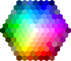
All colors are formed from a combination of three primary colors: red, yellow, and blue. But on the web, the primary colors are actually red, green, and blue (RGB). Yellow can be hard on the eyes when you look directly at it on a screen. Green is a little softer, which is why the three main colors on your computer are considered RGB.
However, just knowing how to make color does not guarantee that you will use the right colors on your website. This lesson is all about learning how to set up a web site with a good range of 4-5 colors and then finding ways to use them creatively throughout the design.
LEARNING GOAL #3: The Basics of CSS
Students will be able to construct multi-page websites using Internal Links and External CSS.
DISCUSSION #1: UNDERSTANDING COLOR
Read More Topic #1 – A New Message from Hakon Wium Lie
“In books, printing color is expensive. On the Web, however, the use of color is virtually free… So displaying color costs nothing… Of course, color can be overdone… color should be used to achieve a purpose with the design. Color thrown in at random doesn’t work well. Remember, too much variety obscures instead of clarifies.”
Hakon Wium Lie, Cascading Style Sheets: Designing for the Web
Topic #2 – Review Questions
- Why was CSS created and how do you pronounce/spell the name of its creator?
- Explain the difference between text and font.
- What is the default font size, font color, and font family in Google Chrome and Firefox?
- What is an external link?
- What are the four main things you need to know when writing CSS?
 Topic #3 – Primary & Secondary Colors
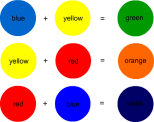
Primary colors are a group of base colors that can be combined to make other colors. The three primary colors are red, yellow, and blue.
Secondary colors are a group of colors that are made from the combination of primary colors. For example, blue and yellow make the secondary color green. Yellow and red make the secondary color orange. Red and blue make the secondary color purple.
Topic #4 – Monochromatic & Complimentary Colors
When you start thinking about the design for a website, at least one specific color should stand out in your mind. A website about love would probably use a lot of red. A website about a warm place in the world would probably have a lot of orange or yellow. For example, if you think of Starbucks coffee, what specific color comes to mind? Does your first thought match the real Starbucks website?
Monochromatic Colors are based on one color and all of the many shades and versions of that color. As you saw with Starbucks, there were several shades of green as well as several shades of brown. And ultimately, even though they use other colors, the website does not contain a lot of random colors. Monochromatic colors allow designers to build on a theme instead of being completely random. Think of it like this: “mono” means “one,” so a “monochromatic color” would be based on one main color.
Even though you did see different shades of green and different shades of brown on the Starbucks website, the fact that you saw two separate colors meant the designer of the Starbucks website had to find colors that would not clash together. The designer would have been looking for something called complementary colors. Complimentary colors are any colors that when put together make the page a little more lively.
Topic #5 – Color Contrast
Now that we know the difference between primary, secondary, tertiary, monochromatic, complementary colors, how can they be properly used on a website? When you look at the following examples, you will notice a number of attractive-looking designs. But what you should begin looking for is contrast. Contrast is the visible difference between colors, between shapes, between font sizes, or between anything that seems to stand out from something else. Let’s look at each one together.
- Website Example #1: Maryland Security
- Website Example #2: Ecoki iPhone Reader
- Website Example #3: Daguia Tortas Finas
DISCUSSION #2: WORKING WITH COLOR
Read More Topic #1 – A Colorful Lawsuit
In 2013, T-Mobile sued AT&T because of a color. Read this article from the Washington Post and see if you can figure out what happened.
Topic #2 – Hexadecimal Values & Hex Triplets
 By now, you should know that browsers do not always display websites in the same way. A page may look very different in Google Chrome when compared to Firefox. For this reason, not all browsers will understand what you mean if you write out the name of a rare color like violet, gold, or honeydew. Click here to see a variety of different color names.
Instead of using those rare and sometimes very strange color names, all browsers now look for 6-digit hexadecimal value combinations of Red, Green, and Blue (RGB). And since there are three different colors being mixed together, these 6-digit hexadecimal values are sometimes just called hex triplets (six digits broken into three colors). Click here to see these hexadecimal values and hex triplets in action.
Topic #3 – The Basics of a Color Palette
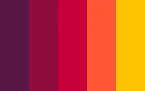
 If you think of a painter standing at a blank wall, you can probably imagine a tray of different colors the painter might wish to use. That tray would be called a palette because it contains a range of colors. In the same way, when you pull out all the most important colors from an image, the range of most used colors in a design is called a palette.
Obviously, a website with no color is boring. But a website with too much color or clashing colors can be overwhelming. So it isn’t good enough to just pick random colors for your design and hope they work. One of your most important decisions as a web designer is to choose colors that are not only appropriate for your design, but colors that actually look good together. Fortunately, the web is full of useful tools for doing just that. Below are a few great examples.
- Color Blending Tool #1: Paletton: Color Scheme Designer (Great Monochromatic Colors)
- Color Blending Tool #2: Adobe: Kuler Color Wheel (Great for Every Color Combination)
- Color Blending Tool #3: Adobe: Kuler Pre-Made Combinations (Great for Getting Ideas)
- Color Blending Tool #4: Sessions: Color Calculator (Not Awesome, but Still Very Useful)
Topic #4 – Color from an Image
Every photograph, even if it is in black and white, has a wide range, or palette, of colors. So imagine you want to use a beautiful image of a red rose as your background. You could pick a random shade of red or green to use for some of the text, links, borders, or shadows on your site, but what if you could find the exact colors in that image and use those instead? Wouldn’t that be better for your design than picking random reds and random greens? Try copying the URL of the red rose picture in this paragraph and pasting it into a Color Palette Generator.
You can also pull colors out of the images in your own folders. Below are a few easy tools for grabbing color from one of your own images. Try using these tools to pull colors from the country images that you used on your last project.
- Image Color Palette Tool #1: CSS Drive Palette Generator
- Image Color Palette Tool #2: Big Huge Labs
- Image Color Palette Tool #3: Color Codes from an Image
- Image Color Palette Tool #4: Color Code Picker
- Image Color Palette Tool #5: Pictaculous Palette Generator
Topic #5 – Assignment: Building a Color Palette
Create a new Notepad document (the old fashioned program) and save it as “pal.txt” in your “misc” folder. You are going to use this document as a way to write and store a list of color palettes for later use.
During the next lesson, you will be building a three page website in black and white, then you will have an opportunity to style your site with appropriate colors either from one of the palettes you save here or from one of the images you use on that day. This is only the first part of the assignment. Applying your color palette is the second and most important part.
Below is a video that better explains the concept of RGB as a way to display color. This will play in the background while you work on setting up a few color palettes.