Learning Goal #6
Students will be able to design a collection of original websites with creative section elements managed through an external, cascading style sheet.
PART 1: Deadlines
Read More
Below are your deadlines for Learning Goal #6: Mastering the Box Model with CSS3. If you complete approximately 1.5 lessons per week, you should be able to keep up with the deadlines.
- April 12, 2019:
5 Lessons Complete (6.1 through 6.5) - May 3, 2019:
6 Lessons Complete (6.6 through 6.11) - TO BE DETERMINED (May 2019):
ICT Final Exam (Web Essentials) - May 6, 2019 through May 28, 2019:
LG6 Final Project
REMINDER: In order to earn an A for each lesson, you need to complete each assignment within the lessons. At the end of each lesson, you will take a short quiz on eCampus and confirm that you have done all the assignments. If you only do some of the assignments, you can still do okay, but it is in your best interest to complete them all. Your grade depends on how much you get done within the time you are given.
PART 2: Overview
Read More
We all know that HTML creates the skeleton of a web page (structure/format), CSS gives the page some skin (appearance), and JavaScript is there to give the page some life (behavior/interaction). It’s also possible to build animations with CSS that look like behavior, but are really just part of the appearance. Today’s lesson is about learning to use Transitions and Transformation in CSS for the purpose of showing animations on a page. If you’ve gotten this far, just remember that most of the WD2 students probably haven’t. Expect these last two lessons (6.10 and 6.11) to be the most difficult of your semester.
Below are some helpful tips and resources that you can use during and after this lesson is over.
CSS Style Tips to Remember
- For now, the transition property works best across browsers if web designers include the vendor prefixes (-webkit-transition, -moz-transition, transition, etc).
- When the transform property is used to scale an element, this means making the element smaller, larger, wider, taller, etc. In other words, scale has to do with adjusting the dimensions of an element.
- When the transform property is used to skew an element, this means making the element crooked or abnormal.
- Certain transitions and transformations may seem like animation, but they require users to interact with the page. For example, moving the mouse over an element and seeing a change that results from link state :hover is not an animation.
- True animations function whether you’re interacting with the page or not. Animations will be studied in the next lesson.
PART 3: Assignments
Read MoreAssignment #1 (1 Point): SoloLearn Lessons
 Log into your SoloLearn account and find the Course called CSS Fundamentals. Inside of this course, watch the following lessons (you will need your headphones), but when you finish, be sure to make note of how many SoloLearn points you have earned. Points are based on how many sections you complete and how many questions you answer correctly after each section.
- Transitions
- transform:rotate()
- transform origin(), translate(), skew()
- scale(), Multiple Transformations
Assignment #2 (1 Point): Design Project
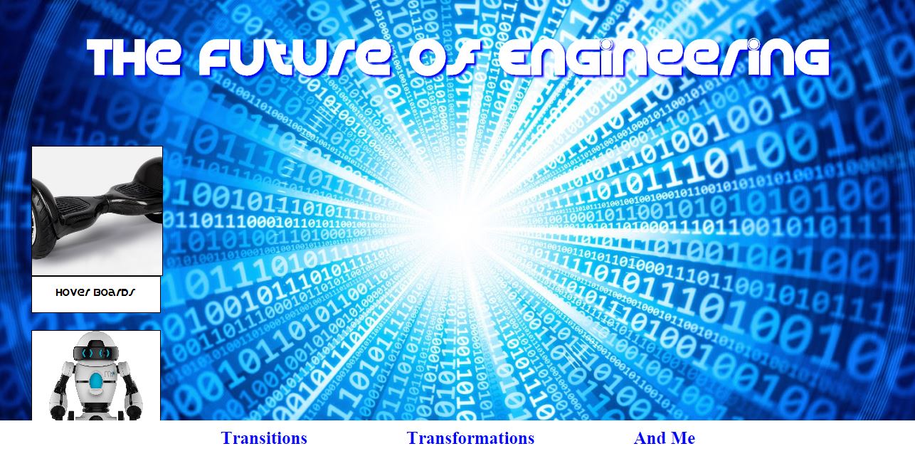
 The purpose of this assignment is to test your knowledge of transitions and transformations and your challenge is to design a three-page website about the Future of Technology. Before you start the steps below, do some online research to find at least 4 future technologies that are either brand new or have not yet been invented. In the example video on the right (click on the image), things like self-driving trucks and floating farms were just two ideas. Your first page will be a gallery of transition images (meaning that when you scroll over the images, they expand). Your second page will be a gallery of transformed images (meaning that you will rotate or skew the same images from the first page). Your third page will be a simple block of clear, futuristic text (a full paragraph) that explains how you might make a difference in the future of engineering.
THE 7 REQUIREMENTS FOR YOUR “FUTURE OF ENGINEERING” WEBSITE ARE THESE:
- 1. You must have a futuristic, but aesthetically pleasing background that works well with the gallery of images you’ll be putting throughout your pages. In other words, don’t just choose a futuristic background with a random picture that will be blocked by something else you put on the page. You’re a web designer now. Think about the visual side. Does it really look right for the purpose you want to achieve?
- 2. You must have a footer with three links that go back and forth between your three pages. The three pages are called Transitions, Transformations, And Me.
- 3. You must have a Futuristic Font used throughout all three pages. If you forgot how to get fonts, you’ll need to revisit the @font-face selector that you learned about in Lesson 6.9.
- 4. You must have a Transitions Page with at least 4 images of futuristic engineering projects. Your images must start small and “transition” to large when the mouse hovers over them. Watch the video again to see what it could look like.
- 5. Your Transitions Page must have short captions below the images that describe the images they are under. To do this, you might want to create caption blocks that are the same width as the small version of the image (before it expands). Just watch the video again to see how the first page might look in your design, but remember that your design doesn’t have to look EXACTLY the same. Be creative. Be a designer.
- 6. You must have a Transformations Page with all the same images from the Transitions Page, but this time, you must find a creative way to “transform” them into a unique gallery or collage. You can use the transform skew, transform rotate, or any other interesting transformation you learned how to do.
- 7. You must have an And Me Page that includes a reasonably sized and well written paragraph about the role that you think you might have in the future of engineering. Be sure to fill out the space by using an appropriate font-size and of course, the @font-face family that you already downloaded.
To make your three-page “future of engineering” website a little more interesting, why not also add a favicon, a title, some headings, or some more detailed descriptions of these futuristic images? You are not required to do this, but if your goal is to design a complete and aesthetically pleasing website, don’t just do the minimum requirements. Always be a designer and design.
Assignment #3 (1 Point): Update Your Index
Similar to the last lesson, take the time to add your new design to your index page using a screenshot and a link. Remember that since you built a three page website, you do not need to provide a link to all three pages. All you need to provide is a link to the first page, which already links to the other pages. Also, remember that the links will have to point into the folder you made.
Assignment #4 (1 Point): eCampus Checkin
You no longer have any review sheets or review quizzes other than the final ICT Exam at the end of the semester. But if you have gotten this far, you still need to check in on eCampus and complete the quiz question that asks whether you finished all the assignments in this lesson. Once you’ve done that, you’re all set for the next lesson.
If you have finished the assignments in this lesson, you will need a new password so that you can enter Lesson 6.11. Feel free to ask the teacher and don’t be afraid to raise your hand or go up to ask. If you are actually finished with a lesson, you will get an answer.